Behind the Scenes: Rating Lab

The last few weeks I’ve had the pleasure to direct a new commercial for the Dutch rating system for movies, television and games, called Kijkwijzer. It’s basically a system that gives parents the usual age recommendation (AL for all ages, 6, 12 and 16), accompanied with a selection of nifty pictograms for Violence, Fear, Sex, Discrimination, Drugs Abuse and Strong Language.
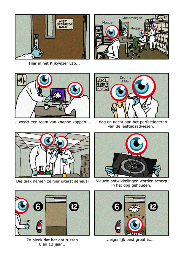
In the past, our production company has made four other commercials for Kijkwijzer. Most of these were 2D animated by yours truly, using original designs by illustrator Shamrock as a starting point.
Here’s how one of those looked:
One of the commercials was shot live action on 16mm film to communicate the slogan “Sometimes watching can be harmful.” Ironically enough, a few TV channels boycotted the final product for being too “anti-television” and it was never aired. It’s probably the first time a rating system was censored, and it will probably be the last…
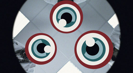
A couple of months ago, Nicam (the institute behind Kijkwijzer) and Paul Verstraeten Communicatie contacted us again. This time, they wanted to introduce a new age classification to fill the gap between 6 and 12. Following their briefing, I wrote a script featuring a cartoony laboratory where a team of Kijkwijzer scientists literally stumble upon the number 9. The script was originally intended to be done as animation, but we ended up producing it live action instead, with real lab people having a giant eyeball (Kijkwijzer’s brand symbol) for a head.

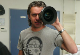
We took this as an ideal opportunity to shoot with the state-of-the-art RED camera, currently used for features as diverse as Jumper, Angels & Demons, Knowing and Soderbergh’s upcoming The Girlfriend Experience. Not an ideal opportunity in the sense that it would provide us with a razorsharp digital picture (on the contrary: I aimed for a grainy, Nordic look along the lines of Roy Andersson’s deadpan comedy You, The Living), but because this particular effects-heavy project could seriously benefit from the creative freedom that 4K of image resolution allows.
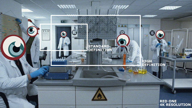
You see, our final product was always going to be broadcast in standard definition. The RED One, however, shoots four times HD. That’s four (4!!!) times the resolution of a Blu-ray disc, thank you very much. In short, that meant we’d be able to frame everything in static mastershots – the ideal condition for visual effects – and still have the possibility to zoom in and out, crop and fool around with each take in post-production, making it all look like it was shot “from the hip,” so to speak.

It took some time to scout the right location. We found that the majority of laboratories looked too cluttered, modern or impersonal for our purpose. I wanted something a little more simple, cosy and stereotypical: how a child would imagine a laboratory, yet still remaining an air of realism. In the end we discovered a showroom for lab products that was perfect for the job. We filled it with lots of props: test tubes filled with colored fluids, microscopes, medicine bottles, an X-ray lightbox, brown plastic coffee cups, an old-school beige computer, etc.
To cut costs, we used colleagues as extras, myself included. (Note to inexperienced filmmakers: never direct your own boss!) All of us wore ridiculous-looking bathing caps with crosses drawn on them for optimal motion-tracking. Below you can see my oldest son as a guinea pig of one of the scientists. I’m the scientist entering through the door and falling through a hole in the floor. (In reality, I fell to my knees on the gaffer’s sand bag; I still have the bruises to prove it.) Needless to say, we had quite a laugh that day.

Post-production lasted about 9 days. Most of this time was spent in-house in Amsterdam, with After Effects as compositing software. We added the eyeballs digitally, as well as hand-held camera movement, tilts, crash zooms and a generous amount of grain. We even put floating bubbles in the test tubes and keyed in steam above a moving coffee cup. Sound design was done at REC Sound and involved another excellent voice performance by Bram van der Vlugt, an eminence grisein the Dutch theatre world.
Well… enough words. Have a look and see the end result for yourself:


I mean, really, it doesn’t take much to impress a rube like me, but really, this is fantastic stuff. I not only love the in-depth look at what you’re doing here, Peet, and the glimpse into how much work goes into an apparently “simple” concept like this, but I also love the lower-tech older spots that you included. On a conceptual level alone, these are nothing short of brilliant.
One evening many years ago my wife and I stumbled into a Piccadilly Circus theater to see Kieslowski’s BLUE and we arrived early because the theater had scheduled a half-hour of “trailers” before the feature. Little did we know that in Europe (or at least in the U.K.) “trailers” doesn’t mean movie previews, but instead 30-second TV ads, of which we saw approximately 50 that night before the film. Once we got over the initial annoyance at our misunderstanding, we actually enjoyed a lot of the spots, which were on the whole so much more interesting and daring (sexually and thematically) than what we were used to seeing in the U.S. And NONE of those were as good as what you’ve just shown us here, Peet. Congratulations. You deserve each and every compliment, perk and new job you get as a result of this work, as well as the many salutes and offers you may not receive. Let us hope that in this instance genius is not overlooked in its time.
I know it’s not quite geographically appropriate, but what the hell– Skoal!
I’d beg to differ that it doesn’t take much to impress you, so I take this as a huge compliment, my friend! Praise should also be directed to my partners-in-crime: D.O.P. Rogier den Boer (one of the best Dutch cameramen around and a close friend), Alexander Fijlstra for his work on the visual effects, my producer Marije Hendriksen and the guys at REC Sound. The “Harmful” commercial was shot by Remko Schnorr.
Peet, it’s the blogger formerly known as Jonathan Lapper and now known by my real name, Greg. Long story but anyway, I loved this piece. I would love to work in film professionally soon but for now doing my own amateur works and graphic designs I can see how you would get excited about this:
that meant we’d be able to frame everything in static mastershots – the ideal condition for visual effects – and still have the possibility to zoom in and out, crop and fool around with each take in post-production
When designing a site for someone or a logo or a banner if I can start with an image 10,000 pixels wide all the better. Then you can work on a tiny area of it and still enjoy the same high quality as a professional photo. Resolution size is everything. It allows for details.
The end product is terrific. I don’t know what anyone is saying in it but I’ve watched it three times now anyway. Great work.
Thanks, Greg! Your comparison to graphic design makes a lot of sense. My background is in graphics, too. The idea to zoom in on high-res video footage was a no-brainer for me, but it raised a lot of eyebrows.
A rough voice-over translation:
Here in the Kijkwijzer lab, a group of clever heads works night and day on perfecting the age recommendations. (Scientist to kid: “Say aaah?”) It’s a task these men take very seriously indeed: all new developments are held against the light. (X-ray shot) Research has shown that the gap between 6 and 12 is rather big… (fall through the hole) and that there’s a growing need for an extra age classification. That’s why Kijkwijzer has finetuned its recommendations with 9 years and up. Want to know more? Visit kijkwijzer.nl.